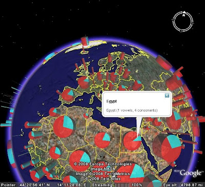
For simplicity I decided to make my test statistic an orthographic comparison of the names of countries, showing the relative length of the country names and their vowel/consonant distribution. (This wasn't because this is a particularly interesting statistic, but it uses easily available data and exercises some of the data processing capabilities of JEQL).
The solution ended up using lots of existing capabilities, such as splitting multigeometries, regular expressions, JTS functions such as interior point, boundary and distance, and of course generating KML with extrusions and styling. The only new function I had to add was one to generate elliptical arc polygons - which is a good thing to have.
The results look pretty snazzy, I think - and would be even better with more meaningful data!


2 comments:
It'd be cool if they did other charts than pie charts - not the most visually accurate graph - but still a great idea.
What sort of charts are you thinking of, Alden? I've done bar charts as well, and 3D chloropleth maps would be pretty easy too.
Post a Comment