CSVReader troute hasColNames: file: "routeLine2.csv";

tCityCount = select count(*) cnt, fromCity city
 from troute
 group by fromCity
 order by cnt desc;

tdata = select city key, cnt value from tCityCount limit 20;

Chart type: "bar"
 data: tdata
 extrude:
 color: "00c0f0"
 showItemLabels:
 xAxisTitle: "Top Cities by Originating Air Routes"
 xAxisLabelRotation: -0.5
 width: 1000
 file: "cityRoutes.png";
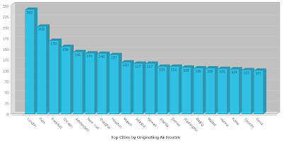
producing this graph:

This uses the same air routes dataset created in a previous example, with a simple grouped summary to show the 20 cities with the most air routes originating in them.
JFreeChart is a bit notorious for being hard to use, but the JEQL command hides all the gory details behind a much simpler (but still powerful) Chart command interface. Currently Bar, XY, and Pie charts are supported. It will be easy to add other chart types as required.
Also on the ToDo list is to provide an option to emit Google Chart URLs, using the same set of options (at least, the ones that are applicable - and maybe some new ones).
Note: this is an experimental extension, which is not in a final state in the current JEQL release.


No comments:
Post a Comment