Markieta's blog post outlines his workflow using ArcGIS. It's a bit cumbersome - apart from having to jump through hoops to read the data from the original DAT files, apparently the dataset has to be split into six parts to be able to process it. (For a measly 58K rows?!)
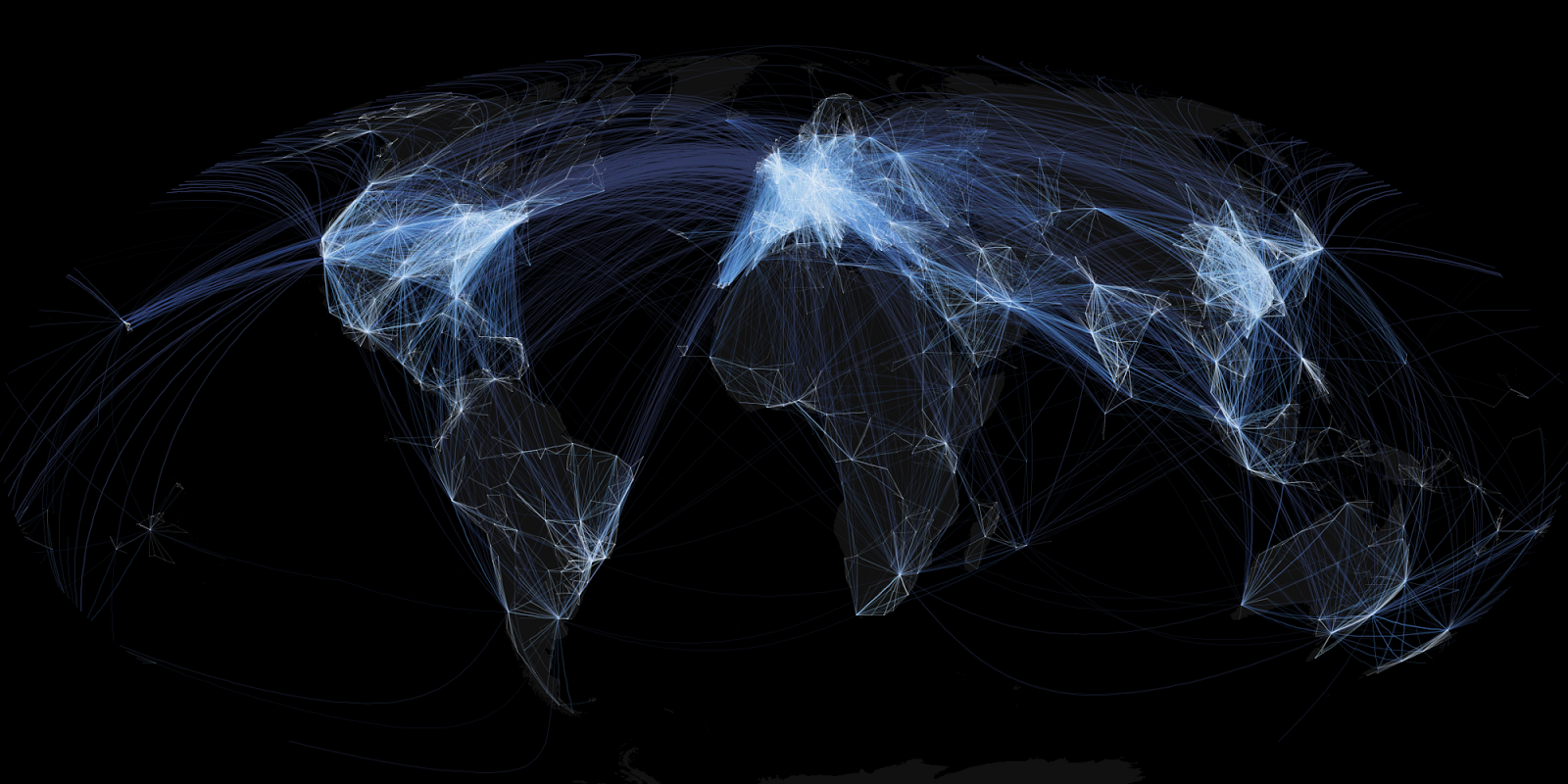
No details are provided about styling, which is the key part of the exercise. The images apparently use alpha blending to show flight density. Also, the coordinate system seems to be more curvaceous than the squaresville Plate Carree I used (so much more haute couture than saying Lat/Long). Both of these are easy to do in JEQL. Here's some samples of the improved output, using the alpha channel and a Mollwiede projection.

Europe
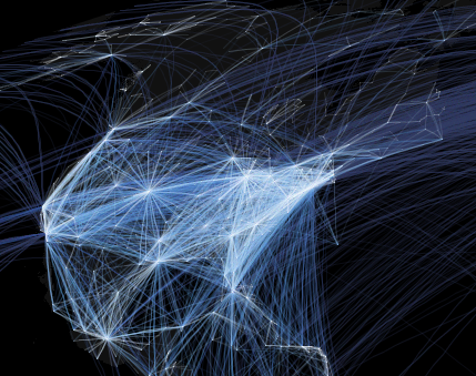
North America
And here's the entire image, in glorious hi-res suitable for framing:


1 comment:
Hi Martin,
I was just reading that stuff earlier on the bus and was thinking: "Hey, somewhere you have read about it much earlier." Now I am reading your blog, and !pling!
Maybe you aren't visible enough to the Interweb and people need to re-tweed you ;) But this is the usual thing. The first is never really recognized.
I actually wonder if there is some plagiarism involved - though, if he has read your post then he never would not have used ArcGIS ;)
cheers
Post a Comment