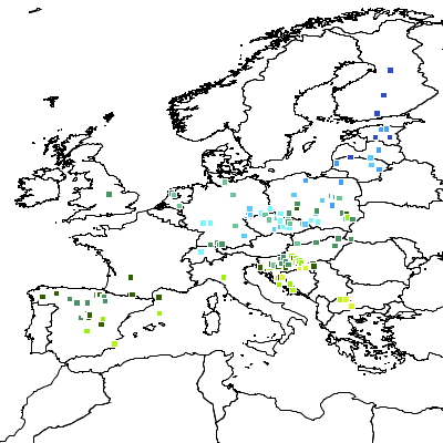
Recently I've been working on generating surfaces from irregular sets of data observations, for thematic rendering purposes. The data I'm working with is meteorological measurements (e..g max and min temperature, average rainfall, etc.). Here's a sample:
 |
| Maximum Daily Temperatures for November 30, 2010 |
There are many, many different ways of interpolating surfaces - Wikipedia has a
long list. It turns out that a classic approach for interpolation of meteorological data is
Barnes Interpolation (also called
Barnes Analysis). Barnes Interpolation is a surface estimating technique which uses an
initial pass to provide a smoothed estimate of the surface, and
optionally further refinement passes to improve the surface to more closely match the observation values. The initial pass produces an
averaged (smoothed) surface, using a summation of exponential
(Gaussian) decay functions around each observation point. Subsequent
refinement passes compute an error surface using the delta between the
previous estimated surface and the observations. The error surface is
added to the previous estimate surface to refine the estimate (by
reducing the delta to the observations).
I'm more of a
vector guy than a raster guy, but I figured that Google and Wikipedia would make short work of this - after all, how hard can raster be? Unfortunately, the Wikipedia article is not very helpful - the description is unclear, and it doesn't even define all the symbols used in the presented equations. I found some better references
here and
here, but they still contained some confusing discrepancies in the equations.
Barnes' original paper is online as well, but as is often the case with primary sources, it is more concerned with the physical properties of the analysis, and doesn't have a very crisp description of the actual algorithm.
Triangulating between the various sources, I eventually arrived at the following algorithm definition (provided herewith without warranty!):
Barnes Interpolation Algorithm
For the first pass, the estimated value Eg at each grid point gx,y is:
Eg = ∑( wi * oi) / ∑( wi )
where:
- oi is the value of the i'th observation point
- wi is the weight (decay function) value for the i'th observation point, defined as
wi = exp(- di2 / L2C )
where:
- di is the distance from the grid point to the i'th observation point
- L is the length scale, which is determined by the observation spacing and the natural scale of the phenomena being measured.
- C is the convergence factor, which controls how much refinement takes place during each refinement step. In the first pass the convergence factor is 1. For subsequent passes a value in the range 0.2 - 0.3 is effective.
During refinement passes the estimate at each grid point is re-computed using:
E'g = Eg + ∑( wi * (oi - Ei) ) / ∑( wi )
where:
- Ei is the estimated value at the grid cell containing the i'th observation point
|
The target development platform is Java (of course). For prototyping purposes I used
JEQL to read sample datasets, run the algorithm with various parameter choices, and produce plots to visualize the results. Here's the surface plot for the dataset above:
This looks pretty reasonable, and provides a nice visualization of the large-scale data trend. (Surprise! It's hotter down south...) The ultimate goal is much more exciting. The algorithm will be provided as a
Rendering Transformation in
GeoServer,
allowing surfaces to be generated dynamically from any supported datastore. This
will open the way to providing all kinds of further surface visualizations,
including other interpolation techniques - as well as everyone's
favourite,
Heat Maps (aka
Multivariate Kernel Density Estimation).
Now, the pure mathematical description of the algorithm is
sufficient for a proof-of-concept implementation producing single images. But to make it usable in a dynamic way in a high-demand environment, there are more details
which need to be worked out to improve performance and functionality.
For instance:
- How large an extent of data points is necessary to produce a
stable surface for a given area? This is important for dynamic
presentation, since zooming, panning and tiling should not change the appearance
of the surface. Of course, all data points could always be used, but more selectivity improves performance.
- How far should the surface be extrapolated into areas of few or no
data observations? Apart from the validity implications, limiting the
extent of the computed surface provides a boost in performance.
- A further performance increase may be gained by computing the
surface on a coarse grid, then up-sampling in an appropriate way to the display
resolution.
- For data which is global in scope, how does the algorithm need to be
changed to accommodate computation on the spheroid? It seems likely
that it's necessary to use a geodetic distance calculation, and there
may be other impacts as well.


